What are Primary Colors and Why Founders and Early Teams Should Take Them Seriously?
When someone visits your product for the first time, they won’t notice your backend architecture. They might not even read your copy. What they will notice—instantly—is color. Color is how we make snap judgments. It is how we decide whether something feels safe, fresh, exciting—or forgettable. And at the heart of every product’s color story is its primary color.
Priya Sreekumar
- 10 minutes Read
- 20 Jun 2025

In 2025, where trust is fragile and attention spans are short, your primary color is doing far more than just making your UI look polished. It is setting the tone, building confidence, and creating emotional connection. This post is about understanding what primary colors really are—and why founders and early teams should take them seriously.
1. What are Primary Colors, Really?
At their core, primary colors are the starting point—the foundation from which all other colors are built.
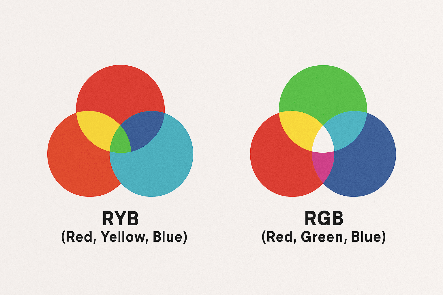
- RYB (Red, Yellow, Blue) – This is the traditional color model, rooted in art and print. Painters and illustrators use this model to mix pigments and build visual compositions.
- RGB (Red, Green, Blue) – This is the digital color model, based on light. It’s how colors are displayed on screens—whether you're designing a mobile app, web product, or SaaS dashboard.
In the RGB model, red, green, and blue light mix in varying intensities to produce every other color you see on your device. For example, pure white is the combination of all three at full intensity. Black is the absence of them.
But in modern UI design, the term “primary color” means something a bit different. We are not just talking about red or blue in a scientific sense. We are talking about the main color you use to represent your brand and interface.
It is the color that:
- Drives your calls to action
- Shows up in your buttons, links, charts, and alerts
- Sets the tone across your app, emails, and onboarding
- Creates emotional cues for how users should feel
In short, it is not just a color—it is the first impression.
2. Why Primary Colors Matter in 2025
Design in 2025 is operating in a new reality.
Users are skeptical. They have seen too many fake websites, generic AI templates, and scammy funnels. They don’t just want speed—they want clarity and confidence.
And color plays a silent but powerful role in all of that.
The second someone lands on your product, their brain starts interpreting visual signals:
Is this brand trustworthy? Friendly? Confusing? Professional? Fun?
Color communicates those emotions before a single sentence is read.
Your primary color, in particular, becomes a central part of that message. It helps:
- Build brand recognition across product and marketing
- Set the emotional temperature of your product
- Guide users subtly through their journey—signaling action, hierarchy, and reassurance
Think about:
- Slack’s purple: Modern, slightly playful, but professional
- Spotify’s green: Energetic, young, a bit rebellious
- Stripe’s deep blue gradients: Stable, powerful, high-trust
These choices are not accidental. They are designed to shape perception—and stick in your memory.
3. Primary Colors = Your Brand’s Personality
Your primary color is your product’s voice before words.
If your brand were a person, what kind of tone would they speak in? Calm and helpful? Bold and fast-moving? Quirky and curious?
Your color helps convey that tone. It becomes part of your product’s personality. This is why it is worth going beyond trends and thinking about alignment.
Ask yourself:
- What emotions do I want to evoke?
- Does this color reflect our values and voice?
- How does it feel across dark and light mode? Mobile and desktop?
Can it scale to both marketing and product?
Let’s say you want to feel trustworthy and innovative. A muted blue might do better than a bright neon orange. If you want to feel disruptive and energetic, a confident red or vibrant pink could help you stand out.
Remember, it is not about being loud. It is about being intentional.
Design Tip: Before locking anything in, test your color in real UI elements—primary buttons, input focus states, loading animations, alert banners. The homepage is only one moment. What m
4. A Good Primary Color System Scales
A single color won’t get you far.
As your product grows, you’ll need different shades for different purposes—hover states, alerts, dark mode, subtle backgrounds, and more. If you don’t plan for this early, you’ll end up with visual chaos.
This is where a design token system comes in. Instead of just “our brand is blue,” you define that blue in structured, reusable parts:
- primary-500: Main button color
- primary-300: Light background variant
- primary-700: Dark mode version
- primary-600: Active or hover state
- primary-100: Subtle fills or input highlights
This structure keeps things consistent—across teams, devices, and time zones. It also makes handoffs between design and development smoother, especially when you are moving fast.
Design Tip: Use shared tools like Figma styles, Tailwind CSS tokens, or Storybook to create a source of truth for your team. A scalable system not just prevents UI debt—it also future-proofs your product.
5. Accessibility Makes or Breaks Trust
Your color might look fantastic to you. But can everyone use it?
Accessibility is not about compromising on creativity. It is about designing for clarity—for the 1 in 12 men and 1 in 200 women who are colorblind. For people using your product at night. For users who are multitasking, distracted, or visually impaired.
Your primary color needs to pass WCAG contrast standards, especially for text and interactive elements. If it doesn’t, your design becomes a barrier—not a bridge.
And here’s the thing: accessible design doesn’t just help edge cases. It improves UX for everyone.
Design Tip: Use accessibility tools like Stark, Contrast Checker, or Figma plugins to validate your palette. Don’t rely on your eyes alone. If your CTA isn’t readable at a glance, it’s not working.
6. How to Choose a Strong Primary Color
If you are choosing a color for the first time—or rethinking a palette that doesn't feel right—here is a framework we use with startups:
- Start with emotion: What do you want people to feel? Safe? Curious? Empowered? Calm? Start with the emotion, then match color families to those feelings.
- Consider your industry—then challenge it: Every category has a color language. Fintech loves blue. Healthtech leans into green. You don’t have to follow the crowd, but you should know what the crowd is doing. Sometimes, standing out means intentionally doing the opposite.
- Test your palette at scale: Don’t pick a color just because it looks good on your landing page. Try it in buttons, banners, sidebars, mobile screens, and empty states. The real test is how it performs under pressure.
- Get feedback: Not from your team—but from real users. What words do they associate with your color? What feeling does it give them?
Color perception is subjective—but consistent feedback gives you direction.
Want to Build a System That Works?
At Crazydes, we’ve worked with startups across SaaS, fintech, logistics, and beyond. And in every case, color is one of the fastest ways to go from generic to memorable.
Because good design isn’t just what looks cool—it is what feels clear, confident, and intentional.
So if you are building something new, refreshing your UI kit, or fixing a palette that just doesn’t feel right—let’s talk. We’ll help you design smarter, scale faster, and connect deeper.
Trust begins with color. Make yours count.